The Project
Nexus Community Partners originally came to us looking for a refresh of their existing site. In the following years, we continued to assist with updates, problems and questions about the website.
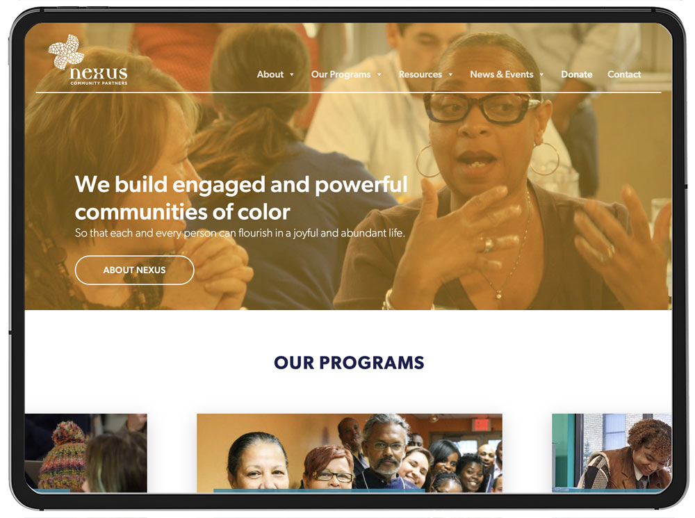
Several years later it became clear that Nexus needed a site that better reflected who they were as an organization, as well as a more streamlined look that was easier to update and loaded faster than the original.
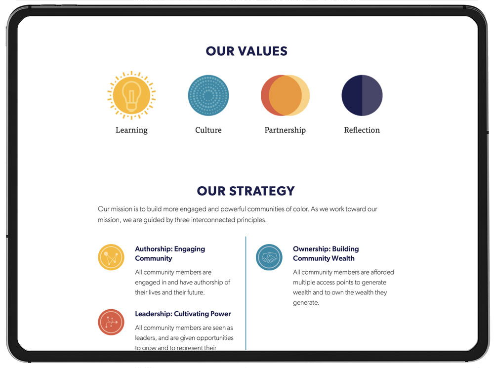
We initially revised their branding guidelines, tweaking the typefaces, colors and general logo configuration.
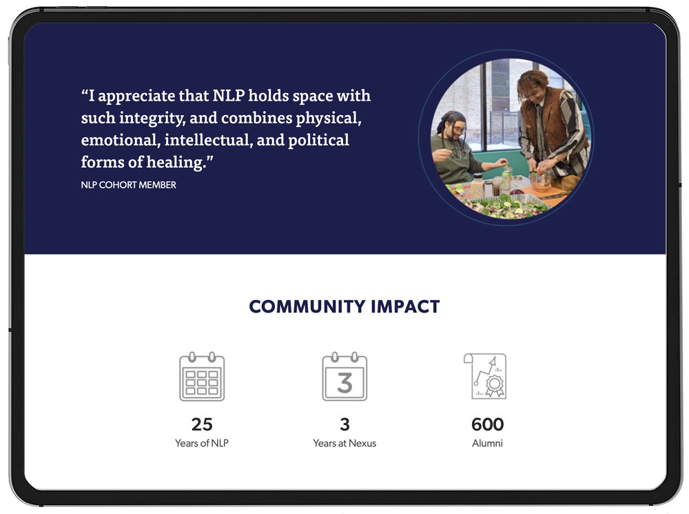
Next we started on their website, collaborating closely throughout the process to make sure each Nexus program was cohesive with the rest but also had its own specific style and layout to reflect the program better.
The design and build ensured a more consistent and contemporary look, as well as speeding up the site considerably to make it easier for visitors to navigate.


